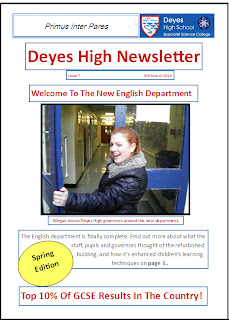
I used a house style which included Deyes logo and motto, as well as the colour scheme of red and blue to represent the school. I believe this made it unique as the masthead really highlights that the newsletter belongs to a specific school. I used the puff to try and promote the edition, as well as using the bright yellow as I believe it stands out a lot to catch the audiences attention. The banner also promotes the school through their exam results.
If I was to redo my reliminary task, I would add a full article to my newsletter, as well as more pictures, so my newletter didn't look so much like a front cover. I would also make my newsletter look a lot more professional, so instead of using Publisher I would use Photoshop.
Finished AS product - the Music Magazine front cover.

Whilst I was researching and planning, I noticed that there were many common features within the front covers, for example; banners, mise en scene of those featured to connote a certain idea, seductive and lack of clothes to attract the male gaze, puffs to highlight additional information and free gifts luring in customers.
Using conventions from real media texts, I included many features. I used the banner to attract a wider audience, as I believe it highlights the other types of musicians from other genres which are included in the magazine. Additionally I used the puff to highlight the Summer festival information which is included in the magazine, attracting a wider audience for those who enjoy live music as well as linking to the idea behind the title. I also included a barcode to create a more realistic image. I used the mise en scene of indie rock so had my model wearing an oversized denim jacket, green dress and shirt to fit in with the stereotypical look. I also had my model wear bright red lipstick and a cross earring to reinforce the male gaze and Cohen's moral panic. Finally, I believe the use of the colour red connotes the definition of revelery, the use of the semiotics is controversial as it is associated with drinking obscene amounts. I have tried to keep my cover as minimal as possible and only included the main story.
Using conventions from real media texts, I included many features. I used the banner to attract a wider audience, as I believe it highlights the other types of musicians from other genres which are included in the magazine. Additionally I used the puff to highlight the Summer festival information which is included in the magazine, attracting a wider audience for those who enjoy live music as well as linking to the idea behind the title. I also included a barcode to create a more realistic image. I used the mise en scene of indie rock so had my model wearing an oversized denim jacket, green dress and shirt to fit in with the stereotypical look. I also had my model wear bright red lipstick and a cross earring to reinforce the male gaze and Cohen's moral panic. Finally, I believe the use of the colour red connotes the definition of revelery, the use of the semiotics is controversial as it is associated with drinking obscene amounts. I have tried to keep my cover as minimal as possible and only included the main story.
If I was to recreate my magazine, I would create a more professional image of my magazine front cover, through using different, more sophisticated fonts. I would also change the colour theme, as the red masthead doesn't go well with the other colours. I would also plau around with photoshop a lot more, to create a better editing within my main picture. Additionally, I would add puffs of other musicians quotes and informing the audience of the other genres involved so the cover wasn't too plain in future.
No comments:
Post a Comment